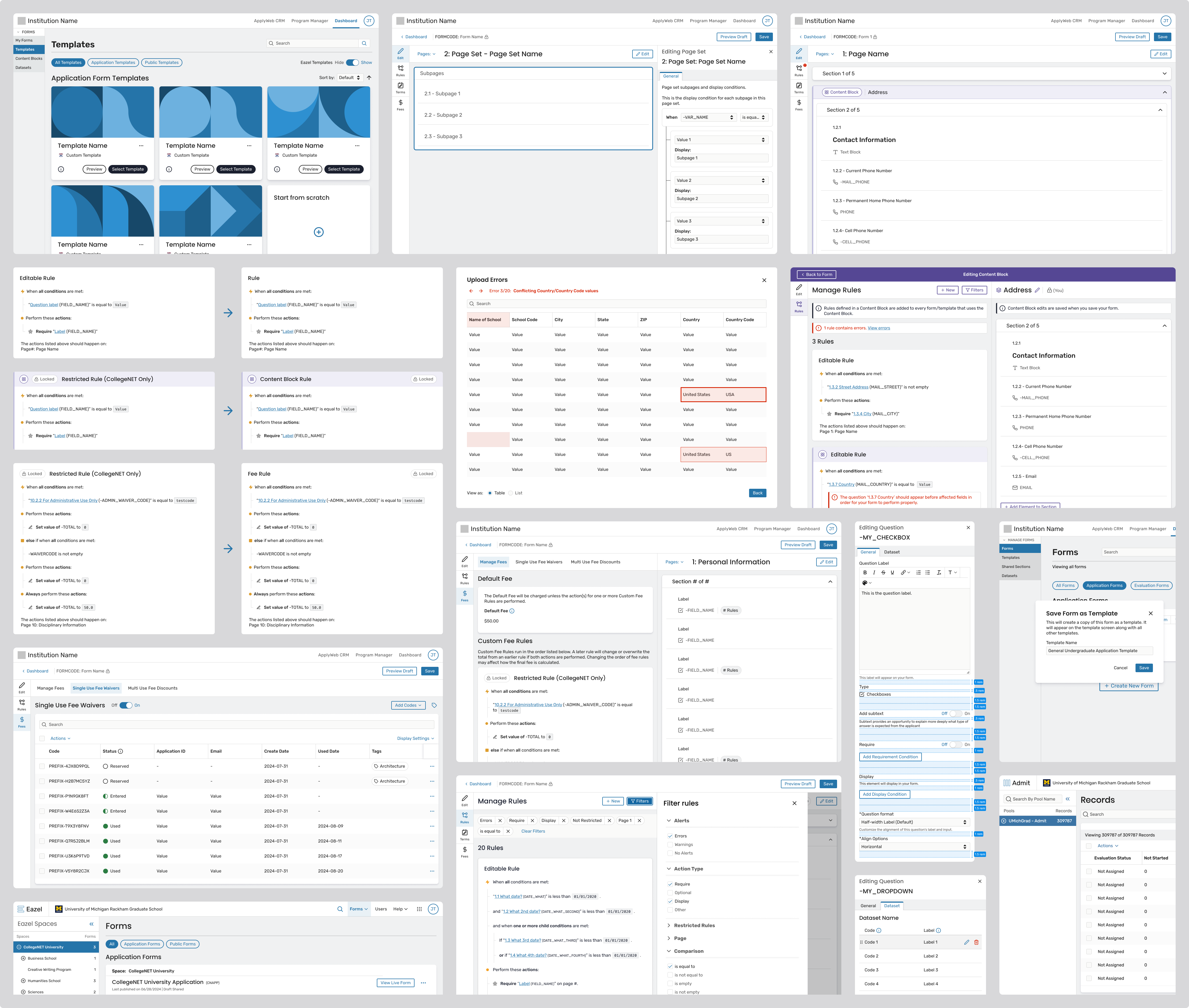
Designing Repeating Sections required solving three hard problems at once:
1. SIMPLIFIED REQUIREMENT MODEL
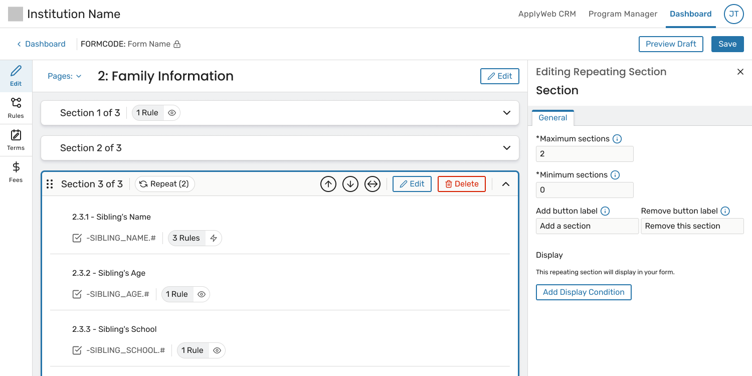
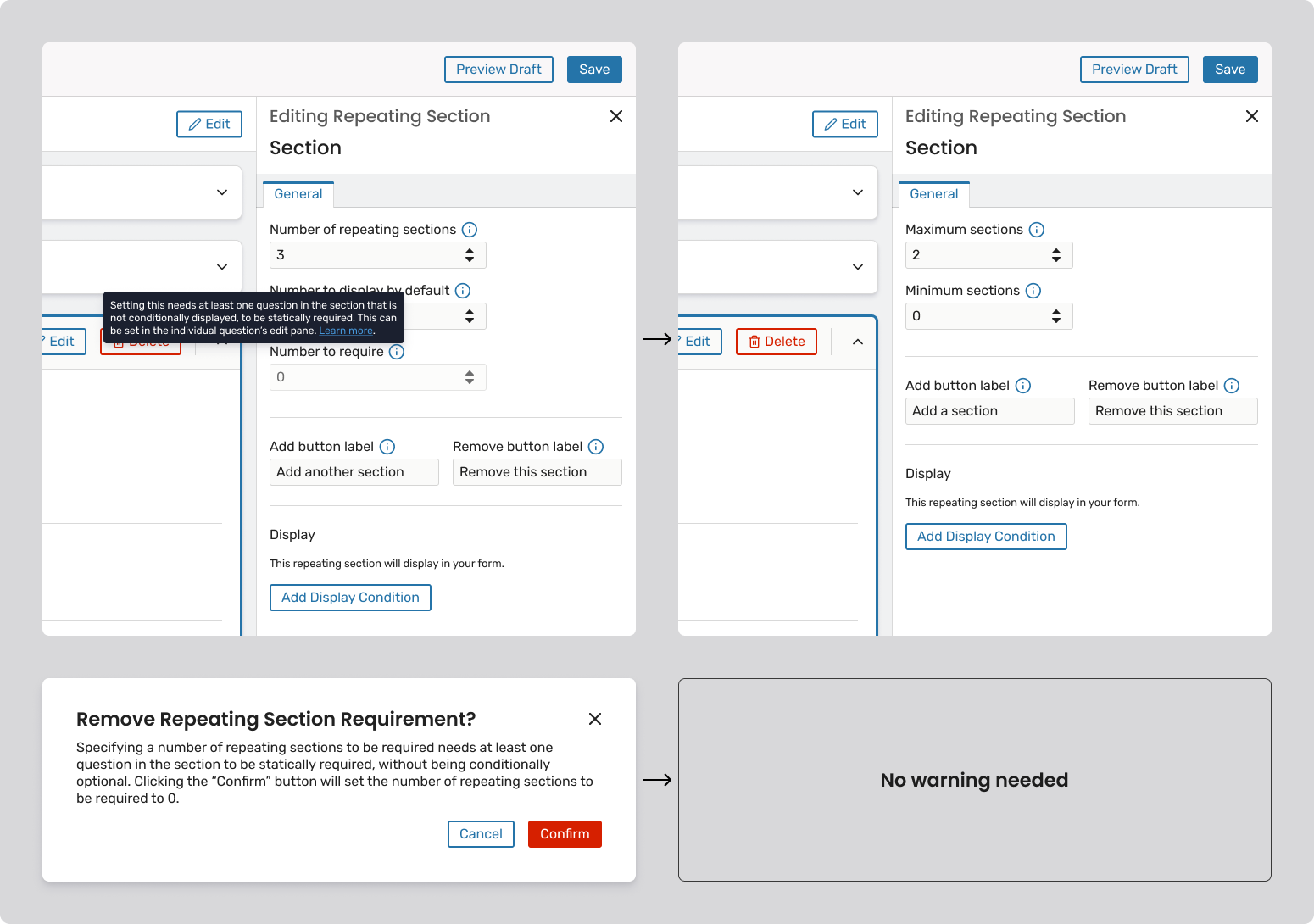
Problem: Early designs for repeating sections relied on multiple numerical controls, such as separate fields for “number of sections to display” and “number of sections required.” While technically flexible, this approach introduced significant confusion.
It was difficult to understand:
To compensate, the UI required increasingly complex warning modals to explain upstream consequences—an approach that added cognitive load and still left room for error.
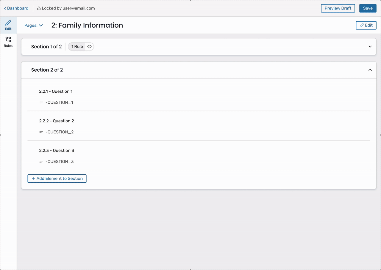
Solution: We significantly simplified the model by removing the separate “Number to require” setting altogether and allowing a single control, “Minimum Sections” (or “Number displayed by default”), to drive both visibility and requirement.
This shift created a much more intuitive mental model:
By tying requirements directly to visibility, we:
This change was widely regarded by the team as a significant simplification that made the feature easier to understand and safer to use.
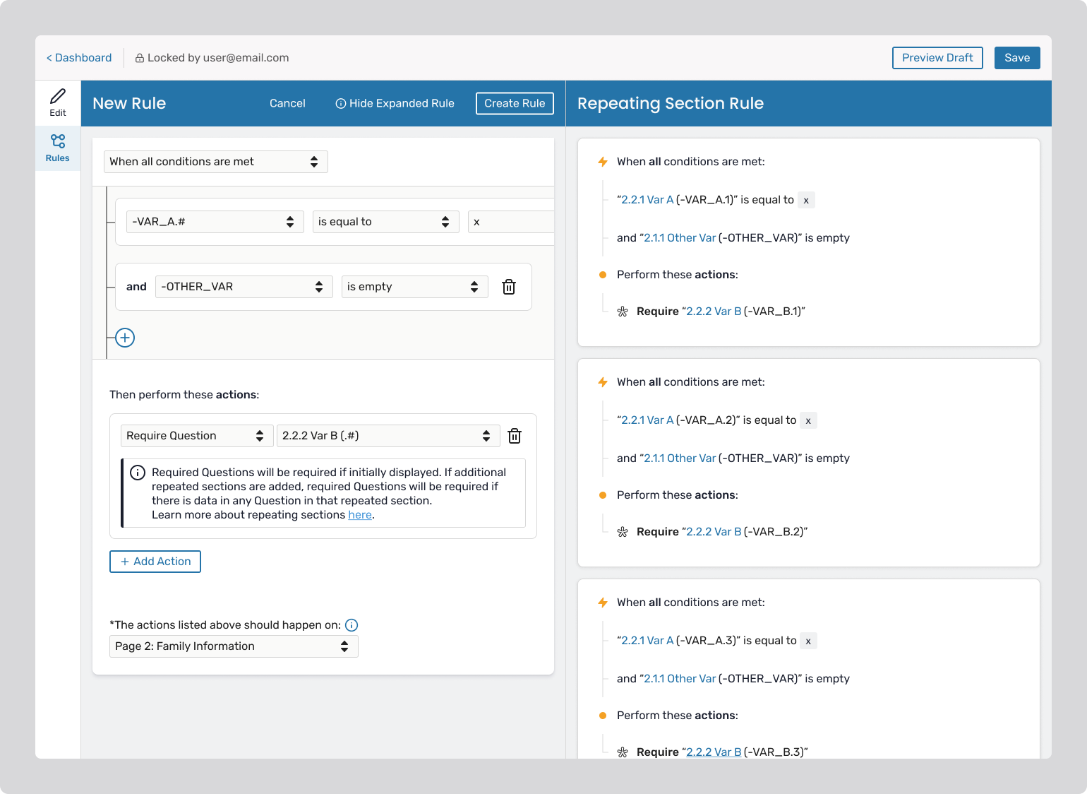
2. CLEAR, SCALABLE RULE LOGIC
Problem: A single rule could expand into many behind the scenes, but this behavior was invisible and hard to trust.
Solution:
This made complex logic transparent and predictable.
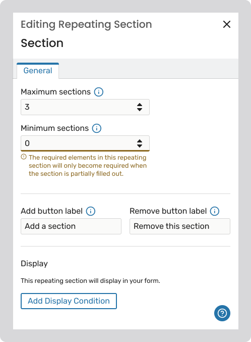
3. AUTOMATIC PREVENTION OF PARTIAL DATA
Problem: Optional repeated sections could be partially filled and submitted.
Solution:
This logic is system-generated and hidden, keeping the UI clean ensuring system consistency behind the scenes.
Designing Transactions required addressing several core challenges:
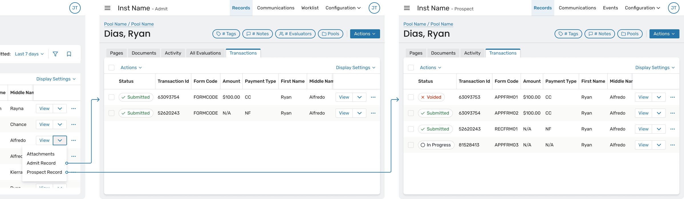
1. ESTABLISHING RECORD RELATIONSHIPS AND NAVIGATION
Problem: Because transaction data originated in legacy systems, it was not always obvious how to trace a transaction back to a person or application within the CRM.
This made it difficult for users to move from “what happened” to “who did this belong to?”
Solution: The Transactions Viewer includes multiple navigation affordances:
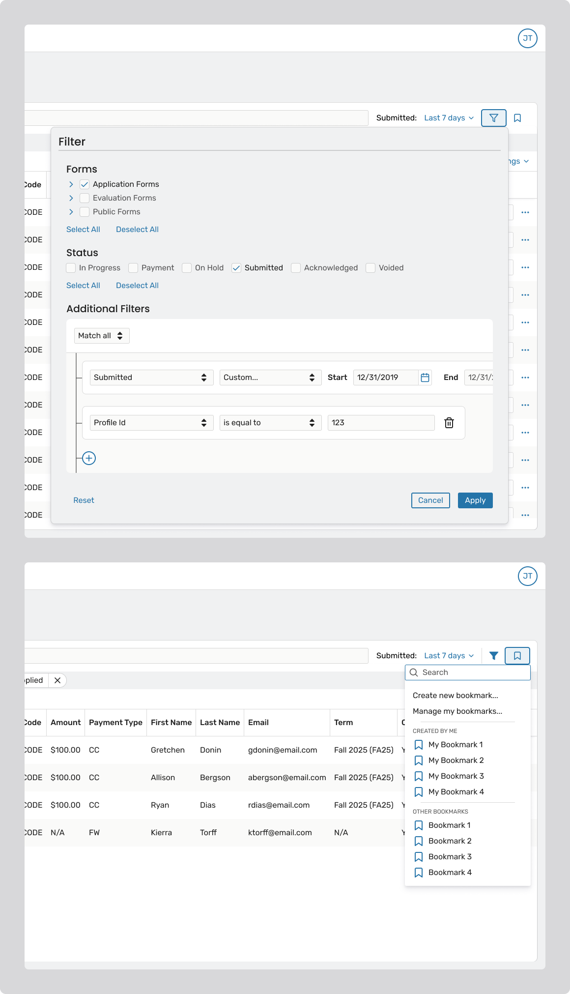
2. DESIGNING POWERFUL FILTERING AND BOOKMARKING
Problem: Users need to repeatedly search transaction data using the same criteria – often across multiple sessions or workflows (e.g., “Submitted applications for Program X this week” or “In-progress transactions awaiting payment”). Without saved views, users were forced to rebuild complex filters each time, which was both time-consuming and error-prone.
Additionally, filtering had to balance power and performance. With large datasets, overly flexible or unclear filtering patterns risked slow queries and user confusion about what data was actually being returned.
Solution: The Transactions Viewer was designed with a clear filtering hierarchy and bookmarkable views to support repeatable workflows:
By pairing performant defaults with bookmarkable filters, the system supports both one-off investigation and ongoing, repeatable workflows, which is critical for high-volume admissions and administrative teams.
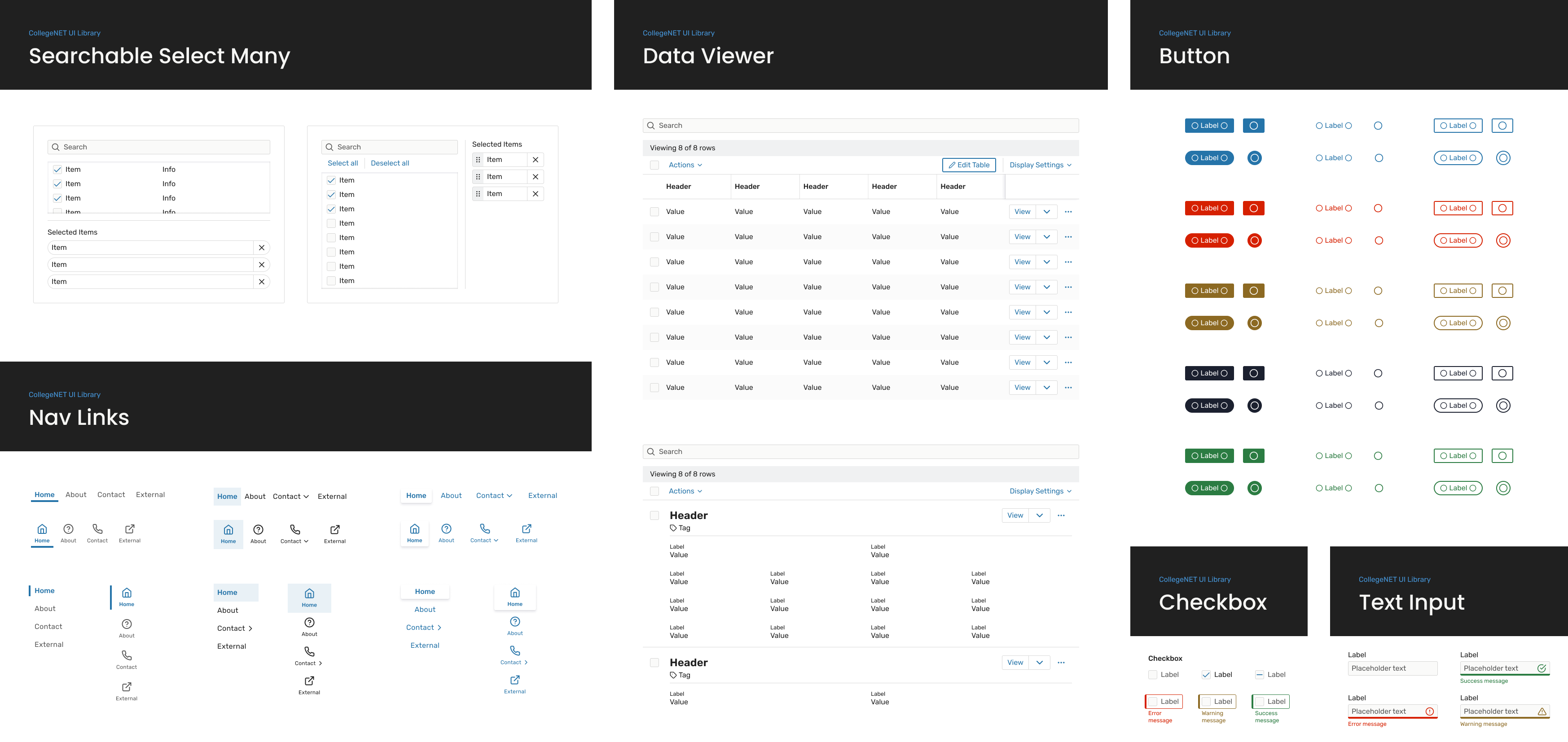
I led efforts to realign Figma components with their coded counterparts, updating structure and behaviors so designers could work more confidently within the system rather than around it. This reduced the need for detaching components and improved consistency from design through development.
In parallel, I took ownership of maintaining and evolving the design system, ensuring it stayed current as the product and codebase changed. I introduced and managed Figma variables, refactoring existing components to use shared tokens for color, spacing, and typography – laying the groundwork for scalability and theming.
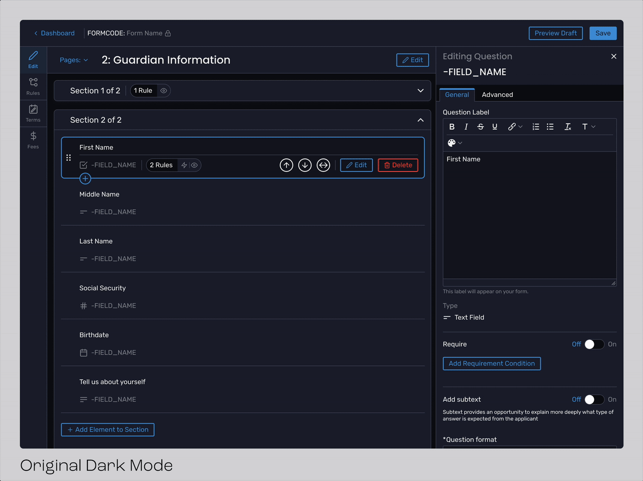
As part of this work, I also was working on a redesigned client-facing dark mode. The existing dark mode had been internal-only and lacked refinement, so I improved contrast, accessibility, and visual consistency to meet production standards.