Focus Ring UI Updates
Focus Ring UI Updates
Focus Ring is a platform by CollegeNET that hosts events and video-based assessments designed to evaluate non-cognitive traits like motivation, discipline, and determination. Participants answer questions and review each other’s responses during structured phases, then receive scores or rankings based on performance. It’s intended to measure personal qualities and potential more authentically than traditional standardized tests.
Focus Ring is a platform by CollegeNET that hosts events and video-based assessments designed to evaluate non-cognitive traits like motivation, discipline, and determination. Participants answer questions and review each other’s responses during structured phases, then receive scores or rankings based on performance. It’s intended to measure personal qualities and potential more authentically than traditional standardized tests.
While functionally stable, the interface felt outdated, overly administrative, and disconnected from its primary audience: 16–22-year-old students. What began as a vague request to “polish” the interface quickly evolved into a focused visual modernization effort. Under tight timelines and technical constraints, we reimagined FocusRing as a contemporary, mobile-first product—transforming it from a dark, utilitarian tool into a clean, student-centric experience.
While functionally stable, the interface felt outdated, overly administrative, and disconnected from its primary audience: 16–22-year-old students. What began as a vague request to “polish” the interface quickly evolved into a focused visual modernization effort. Under tight timelines and technical constraints, we reimagined FocusRing as a contemporary, mobile-first product—transforming it from a dark, utilitarian tool into a clean, student-centric experience.
The Challenge:
Designing the FocusRing refresh required solving several intertwined visual problems:
An outdated dark-mode-only interface described by stakeholders as resembling a “Commodore computer game,” which felt more like an internal admin tool than a student product
An outdated dark-mode-only interface described by stakeholders as resembling a “Commodore computer game,” which felt more like an internal admin tool than a student product
A lack of visual hierarchy, making it difficult to distinguish urgent actions from passive information
A lack of visual hierarchy, making it difficult to distinguish urgent actions from passive information
A dated visual language, including arbitrary numbering systems and inconsistent iconography that didn’t guide the eye or feel modern
A dated visual language, including arbitrary numbering systems and inconsistent iconography that didn’t guide the eye or feel modern

The Process: Iterative Collaboration Under Constraint
The Process: Iterative Collaboration Under Constraint
DISCOVERY & CONSTRAINTS
From the outset, the team aligned on a few key realities:
The redesign had to be mobile-first, anticipating that over half of users would
access the platform on their phones
The redesign had to be mobile-first, anticipating that over half of users would access the platform on their phones
We needed to work within existing Material Design components to ensure rapid implementation
The redesign had to be ready for a fast approaching event, limiting scope
Although there was a pattern library that was used on other products, this project required a lighter-touch, UI-focused updating rather than a full system overhaul.
EXPLORING VISUAL DIRECTIONS
In early reviews, we presented three visual approaches:
A simple “Light Mode” skin applied to the existing layout
A new layout using cards, rounded corners, and stronger hierarchy (ultimately chosen)
A strict Material Design implementation
The selected direction preserved technical feasibility while introducing a cleaner, more modern layout system.

THE PIVOT tO LIGHT MODE
A key visual decision was to move away from a dark-mode-only interface.
Supporting both dark and light modes at this stage would have added significant QA and development overhead, so we focused on establishing a flexible color system instead. A new variable-based color scheme was created to support scalability and consistency.
We made the decision to revisit a dark mode based on this new color system as a post MVP improvement.

Key Visual Improvements & Design Decisions
Key Visual Improvements & Design Decisions
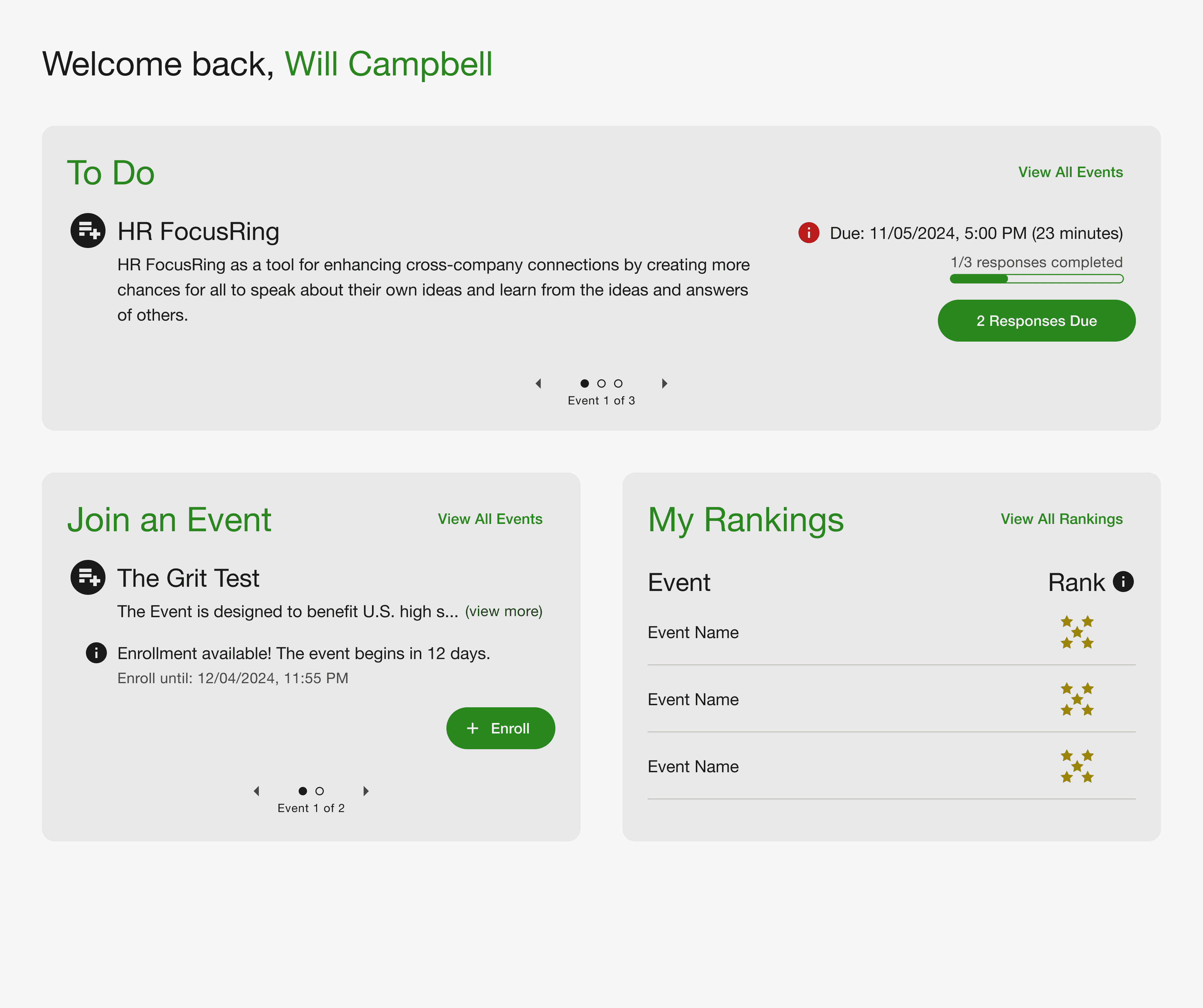
REIMAGINING tHE DASHBOARD wITH CLEAR VISUAL HIERACHY
REIMAGINING tHE DASHBOARD wITH CLEAR VISUAL HIERACHY
The Problem
The original homepage presented events in a flat list with little differentiation. Urgent
actions were visually indistinguishable from passive content.
The Problem
The original homepage presented events in a flat list with little differentiation. Urgent actions were visually indistinguishable from passive content.
The Visual Solution
We introduced a card-based layout with a clear hierarchy:
The Visual Solution
We introduced a card-based layout with a clear hierarchy:
A dynamic “To-Do” card appears at the top when action is required
A dynamic “To-Do” card appears at the top when action is required
Items due within 7 days are marked with a red urgency icon
Items due within 7 days are marked with a red urgency icon
In the absence of urgent tasks, the “Join Event” card becomes the primary focal point
In the absence of urgent tasks, the “Join Event” card becomes the primary focal point
This restructuring created immediate visual clarity without changing core functionality.
This restructuring created immediate visual clarity without changing core functionality.
CARD-BASED LAYOUT & VISUAL REFINEMENT
We modernized the layout using:
Rounded card containers
Rounded card containers
Increased white space
Increased white space
Improved typography scale and contrast
Improved typography scale and contrast
Clear separation between content groups
Clear separation between content groups
These refinements gave the platform a consumer-product feel rather than an internal administrative tool.
Outcome
The redesigned interface received strong stakeholder approval:
Described as “super clean”
One stakeholder noted feeling “exponentially better about the product”
Successfully delivered in time to meet event deadline
Most importantly, the platform shifted visually from feeling dated and institutional to contemporary and student-friendly without requiring a full rebrand or codebase rewrite.
Most importantly, the platform shifted visually from feeling
dated and institutional to contemporary and student-friendly without requiring a full rebrand or codebase rewrite.
Reflection
Reflection
This project reinforced the power of focused visual refinement. Under tight timelines and technical debt, we were able to elevate the product’s perceived quality through:
Stronger hierarchy
Cleaner layout systems
Intentional iconography
A decisive shift to light mode
Rather than adding complexity, we modernized through subtraction—clarifying structure, simplifying visuals, and aligning the interface with its audience.